Back to projects
Kraft Heinz Digital Transformation
Modernising Legacy Systems for Enhanced Efficiency & User Experience
Modernising Legacy Systems for Enhanced Efficiency & User Experience
Industry
Food Manufacturing
Client
Kraft Heinz
Team
2 BAs & 5 Designers
Timeline
12 months
1. Project Summary
KraftHeinz, a global leader in the food and beverage industry, sought to modernise its Microsoft Access-based applications into a centralised web portal. This digital transformation initiative aimed to improve usability, accessibility, and efficiency while addressing pain points in UI/UX, system performance, and data management.
This project focused on:
✅ Reviewing existing Access applications to understand business rules, workflows, and data structures.
✅ Designing a modern, centralised web portal with an intuitive UI, optimised for usability, efficiency, and accessibility.
✅ Enhancing performance & business impact, giving back 2000+ hours annually to business teams.
Key Challenges:
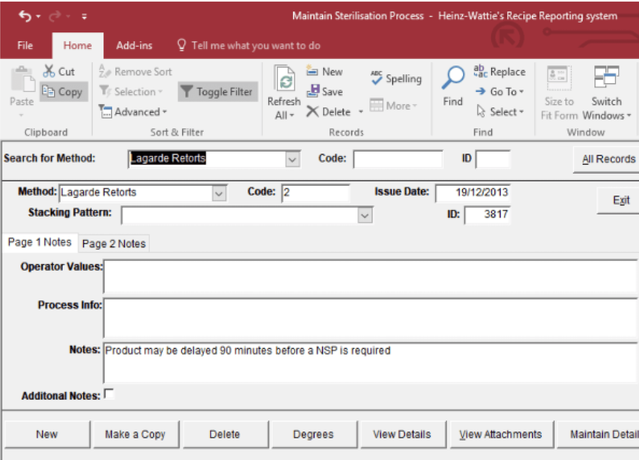
❌ Outdated UI & Poor User Experience – The existing system lacked modern UI principles, making it difficult for users (primarily aged 40-50) to navigate efficiently.
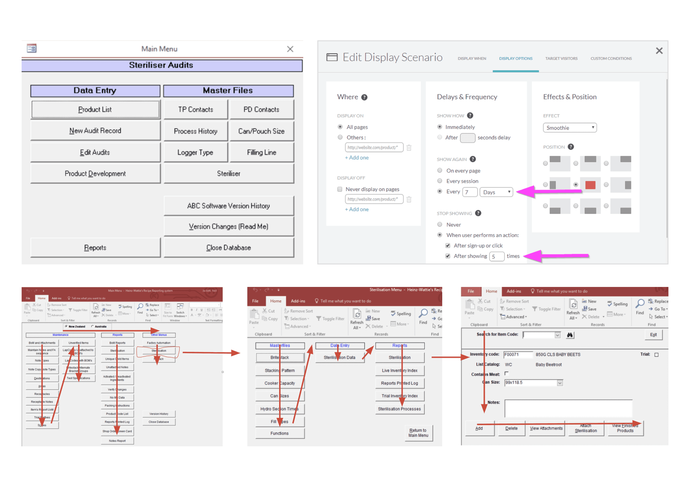
❌ Lack of Mobility & Accessibility – The Microsoft Access-based system was inflexible, requiring local installations and lacking 24/7 access.
❌ Inefficient Navigation & Workflows – Users struggled to locate key information, leading to longer processing times and errors.
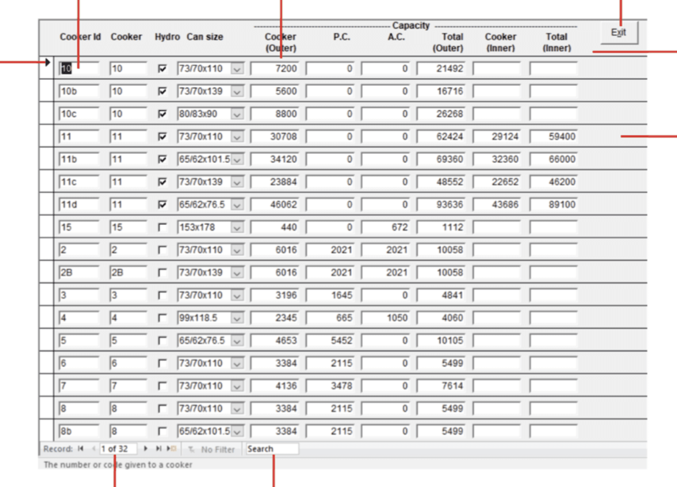
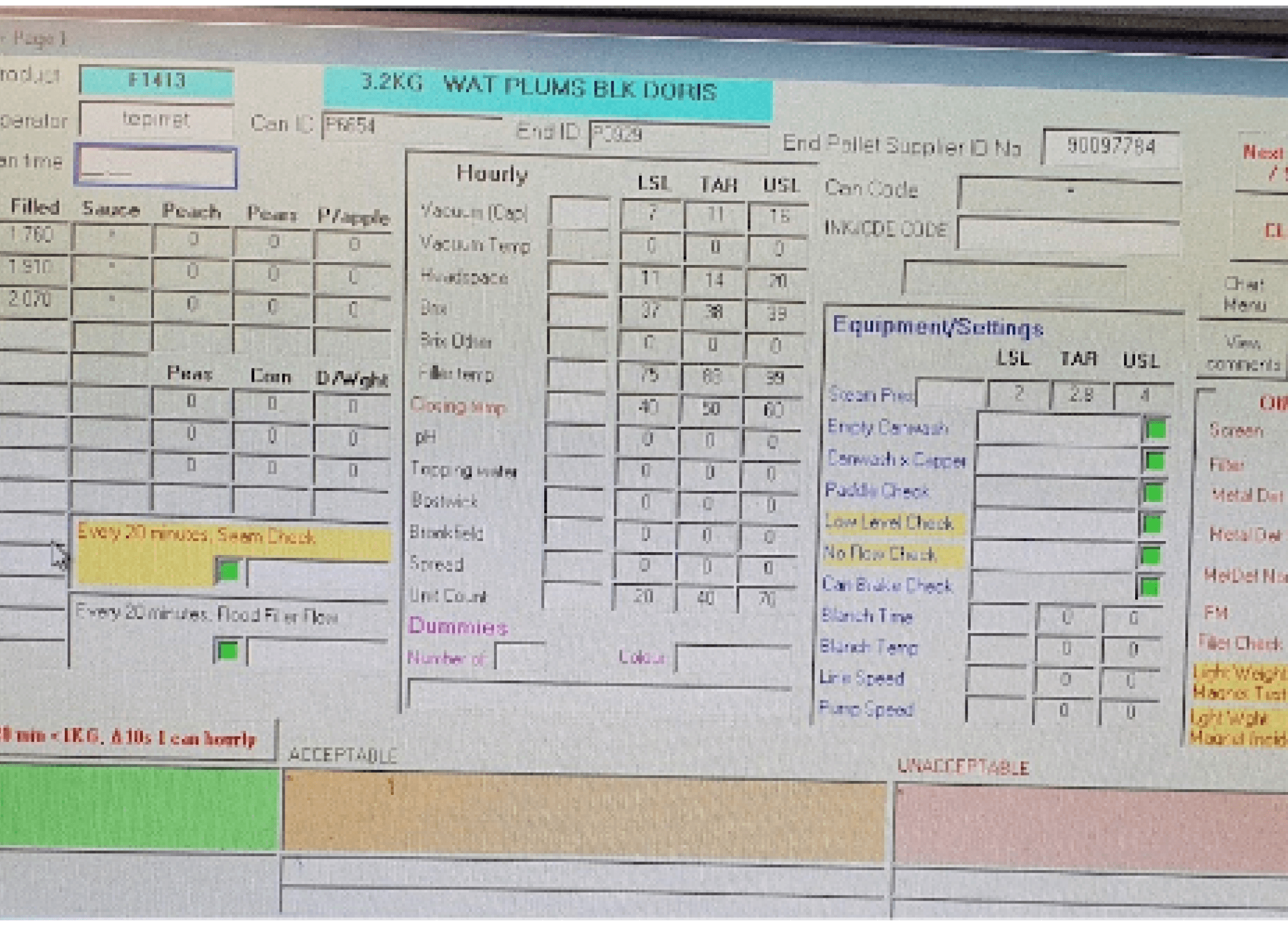
❌ Data Overload & Poor Visual Hierarchy – The complex, unstructured tables made it hard to scan & interpret large datasets.
2. Problem Statement & Business Impact
The Problem Statement
Inefficient workflows resulted in productivity loss & operational bottlenecks.
UI issues (small text, poor contrast, cluttered screens) hindered usability, particularly for older users.
The lack of a centralised system made data inconsistent & difficult to track across departments.
Navigation was unintuitive, requiring excessive steps to access key functions.
Business & User Impact
📉 2000+ hours saved annually by improving workflow automation & tracking.
📈 Significantly reduced processing times for leaders, production planners, and technicians.
⚡ Improved system reliability & access, enabling 24/7 availability.
💰 Enhanced revenue impact by optimising operational efficiency.
3. My Roles as a Product Manager
Stakeholder Collaboration & Business Research – Worked with leaders, production planners, and technicians to define user needs.
Product Roadmap & Prioritization – Outlined MVP scope & feature prioritization based on business impact & user feedback.
Cross-Functional Team Leadership – Coordinated UX designers, engineers, and business analysts to ensure alignment.
End-to-End Product Lifecycle Management – Managed the planning, execution, testing, and optimisation of the new web portal.
Performance Monitoring & Continuous Improvement – Implemented key performance metrics (KPIs) to measure efficiency gains & adoption rates.
Also, guide the team:
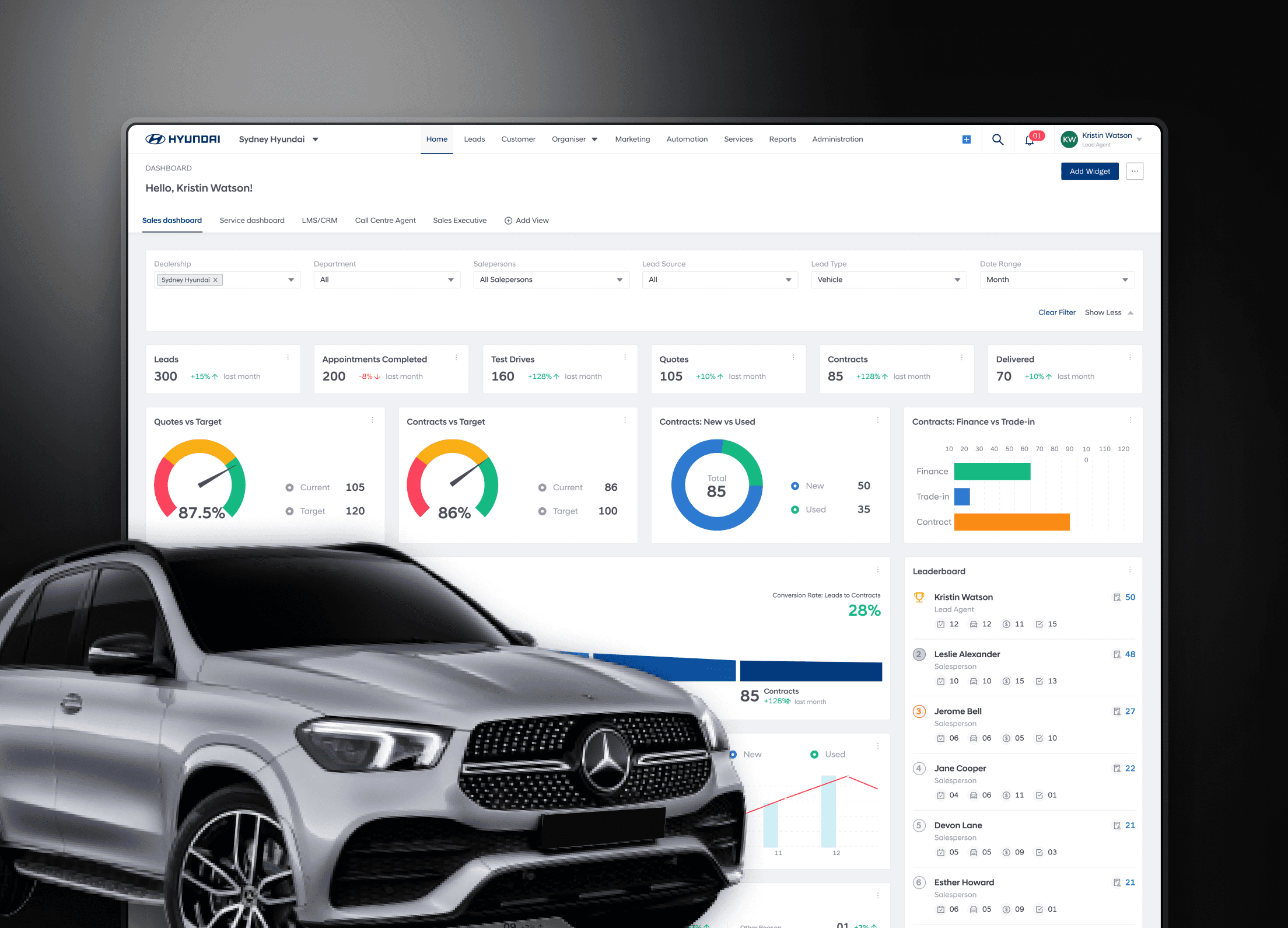
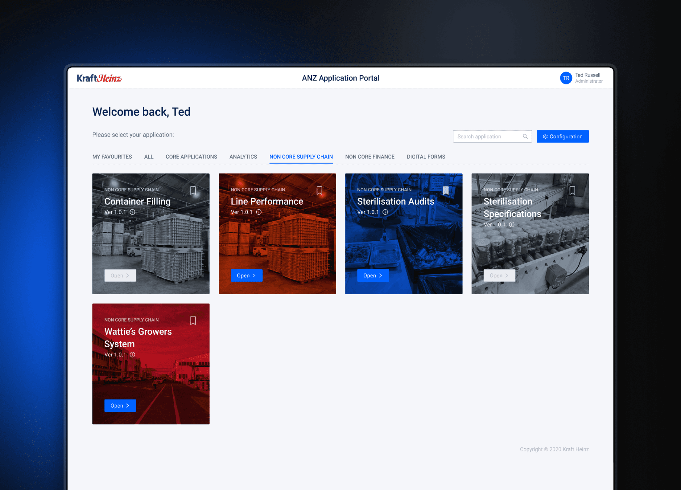
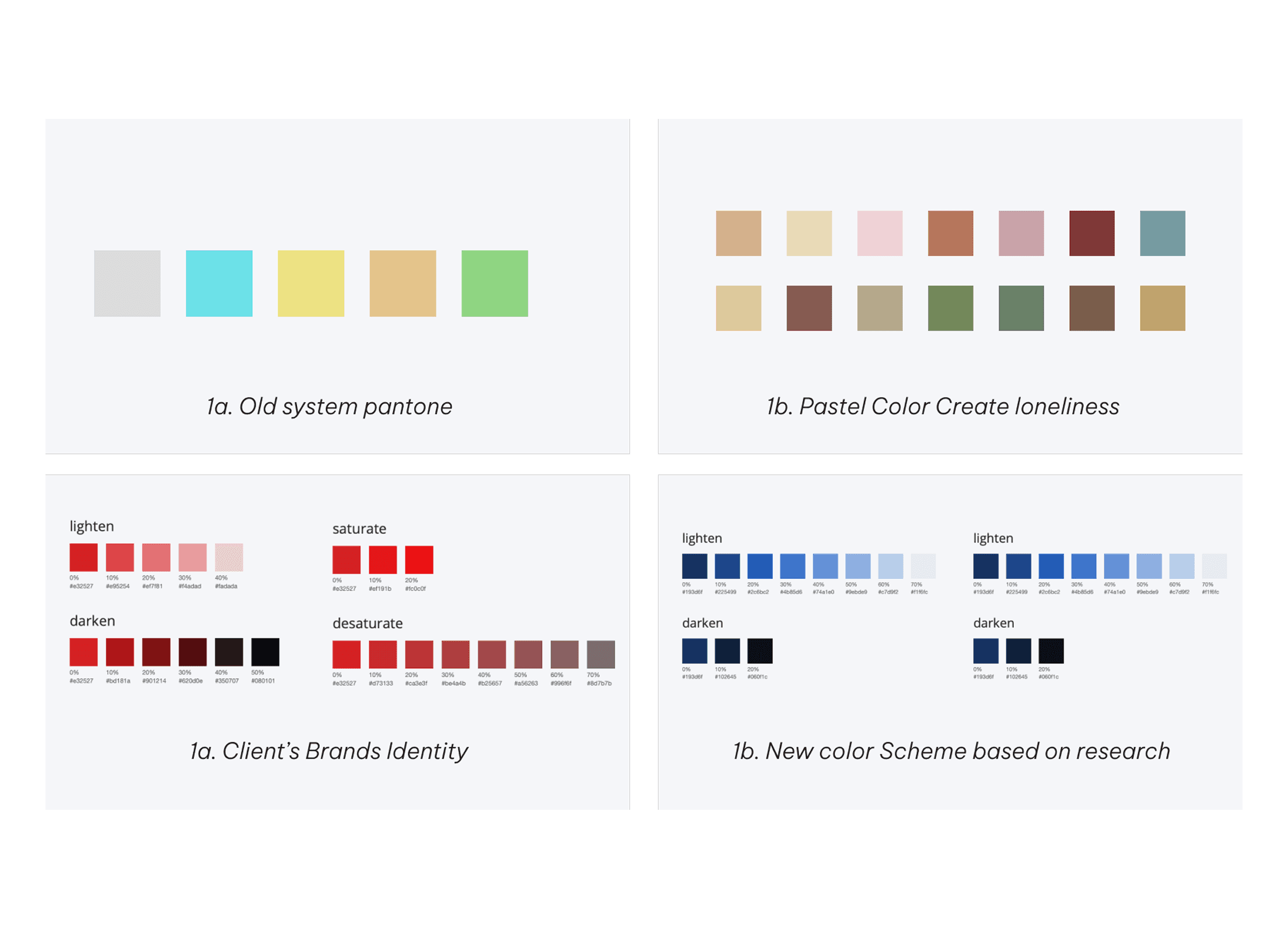
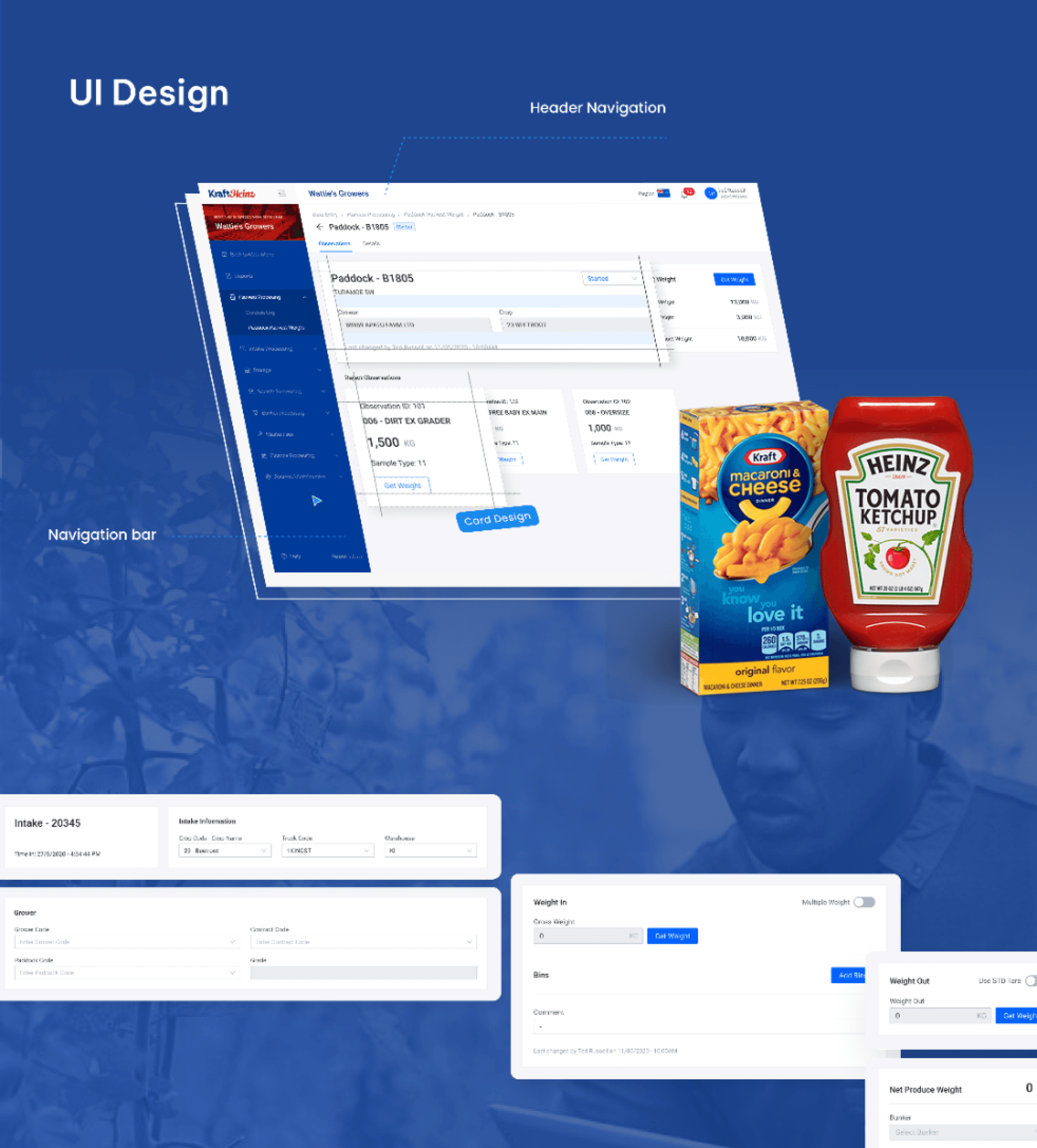
UI Redesign Focused on Accessibility – Designed larger buttons, clearer typography (Roboto), and an optimized color palette for older users.
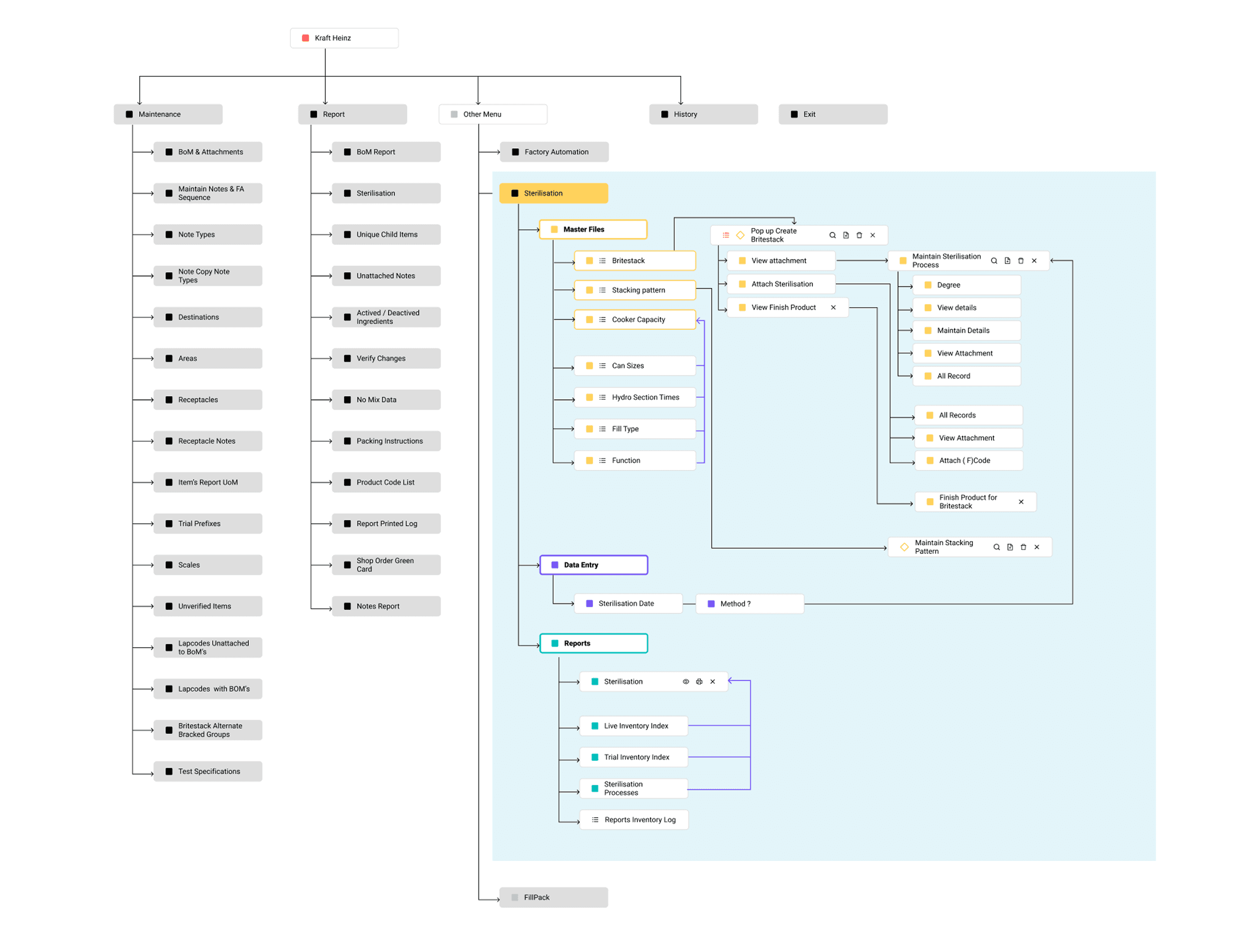
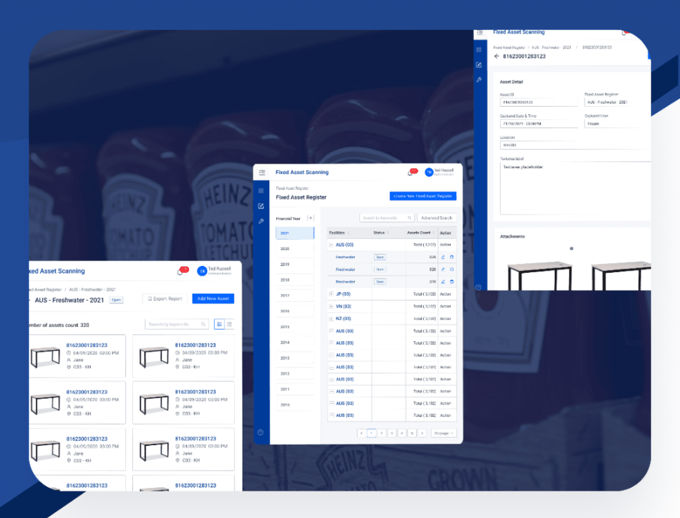
Improved Navigation & Information Architecture – Introduced breadcrumbs, clear menu hierarchies, and larger touch targets for easier interaction.
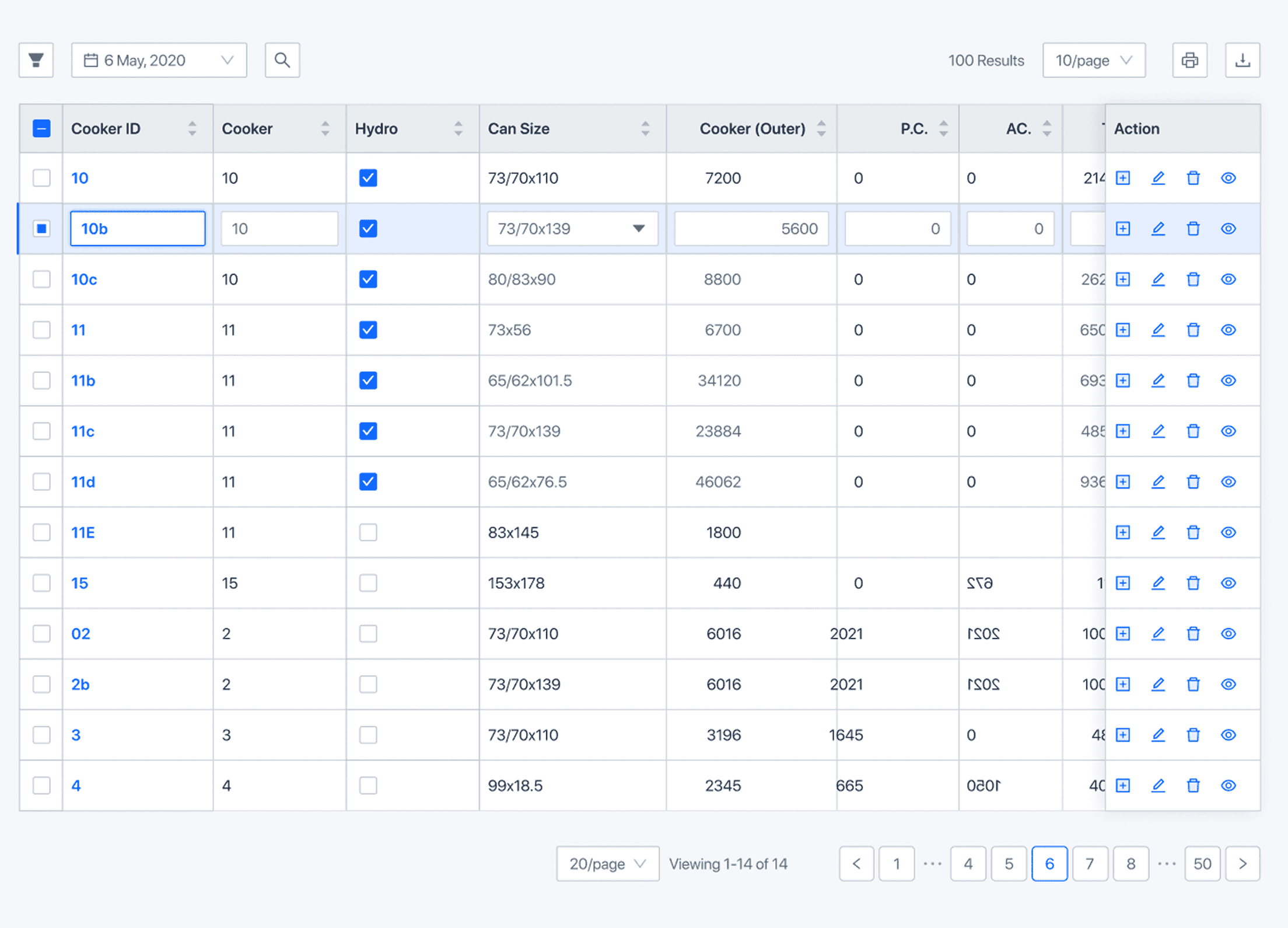
Table Redesign for Enhanced Data Scanning – Applied Horizontal Line Styling for better readability, aligning data based on type (text, numeric, percentage).
Modernised Forms & Popups – Replaced cluttered, outdated modals with streamlined, purpose-driven popups.
Responsive & Mobile-Friendly UI – Ensured optimal usability on all devices, allowing users to access the system anywhere.
4. Research & Insights (Understanding the Problem)
User Research & System Analysis
🔍 Target Audience: Leaders, Production Planners, Technicians, Senior Planners (ages 40-50).
📊 Pain Points: Users struggled with poor UI contrast, confusing navigation, and dense, unreadable data tables.
📈 Industry Benchmarking: Studied best practices in enterprise UX for data-heavy applications.
Key Insights & Takeaways
💡 Users needed a UI with high contrast, clear typography, and intuitive navigation.
💡 The existing color scheme & fonts (Arial, pastels) created usability issues.
💡 Navigation was inefficient, requiring multiple clicks to find key information.
5. Solution & Execution (How We Solved It)
🎨 Improved UI Design for Accessibility & Readability
Introduced high-contrast colors (blue for reliability, red for energy, soft oranges for warmth).
Switched to Roboto Font for improved readability across different screen sizes.
🗺️ Simplified Navigation & User Workflows
Added breadcrumb navigation & hierarchical menus to improve workflow tracking.
Used icons & big-text labels for easy menu recognition.
📊 Table Optimisation & Data Presentation
Redesigned tables using Horizontal Line Styling, ensuring clearer data visualization.
Aligned data based on type (left-aligned for text, right-aligned for numerical values).
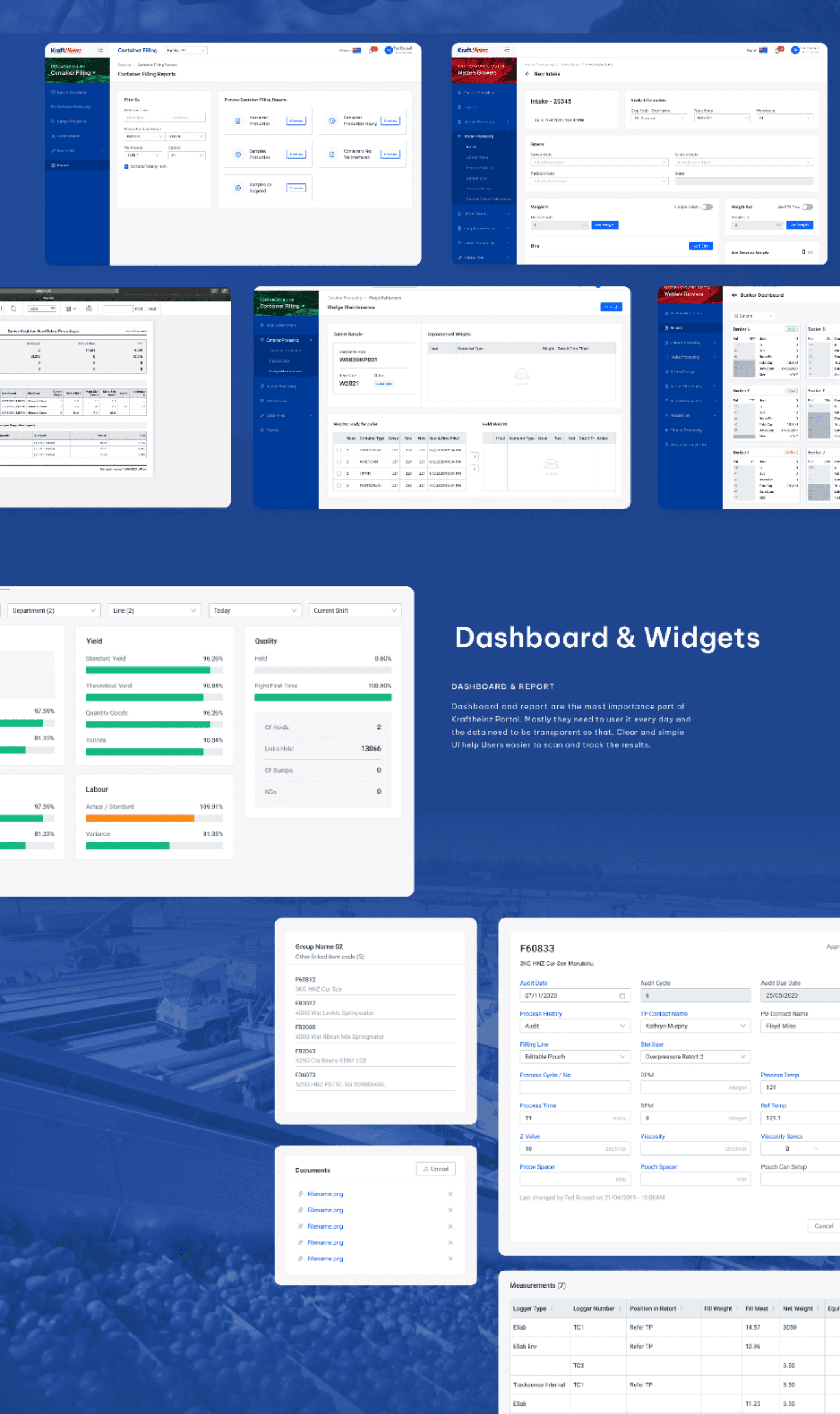
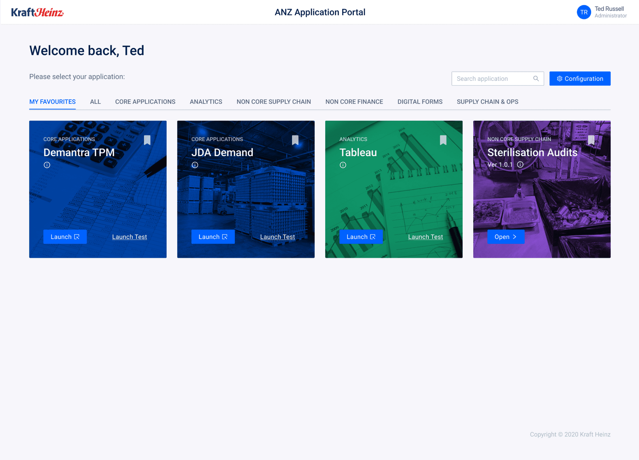
📂 Centralised Web Portal with Responsive Design
Migrated all Microsoft Access applications into a single, web-based platform.
Enabled mobile access & 24/7 availability for better business continuity.
🚀 Optimised Performance & Workflow Automation
Automated audit tracking, reporting, and user management tools to improve efficiency.
Results & Impact
📈 2000+ hours saved annually, improving workflow efficiency. 📉 50% faster navigation & data retrieval through improved UI & table layouts. ⚡ Significantly enhanced accessibility, with a modern UI suited for older users. 💰 Increased operational efficiency, reducing dependency on Microsoft Access. 🎯 Improved audit tracking & workflow automation, leading to better compliance & accountability.